Web design and brand design. Content creation.
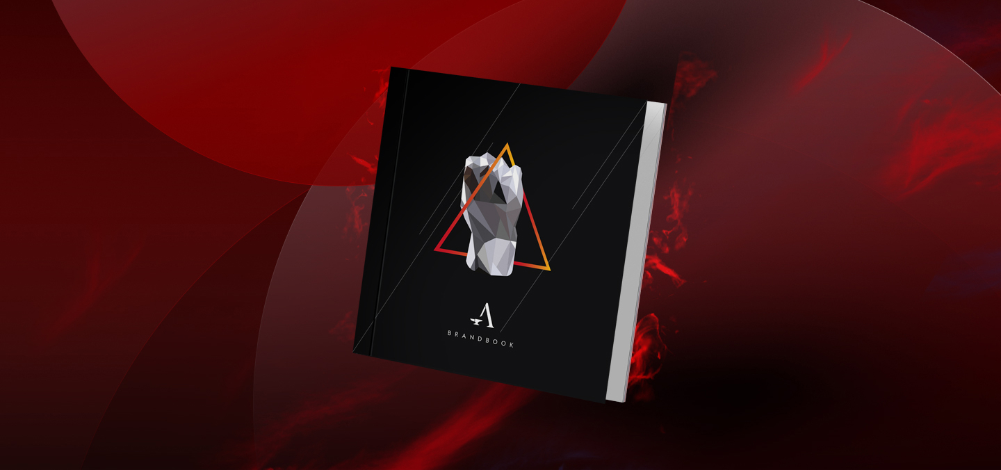
The overall concept — an anvil, where a person forges his steel strong body.
The inspiration was ancient Greece where people were very athletic and cared about their strength and physic.
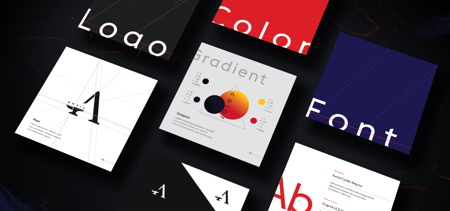
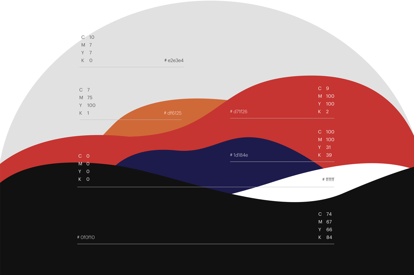
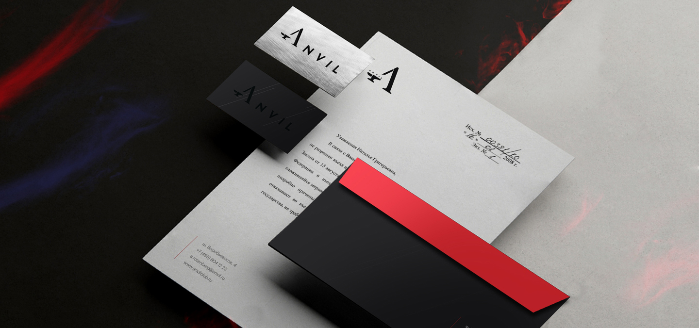
Hence why we chose minimalism and masculinity and used steel while designing business cards and pointers.
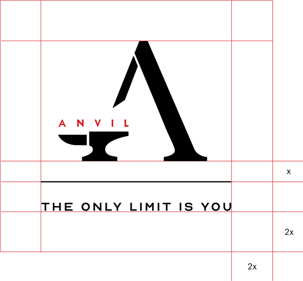
The inspiration for the logotype came from the name Anvil. The logo is mage of a mix: the letter A with the recognisable shape of an anvil.
According to the brand's motto, the fitness club is only the instrument for crafting the strong body, but the final result depends on the person and his or her devotion. The only limit — is you!
- Create the website for the club’s launch.
- Show the unique atmosphere of the club: the idea, the concept, the design.
- The site must provide the users with the ability to book a class, fond out the schedule and see all the news.
- The website must also inform the users of the club’s premium services: top notch equipment, skilled trainers etc.
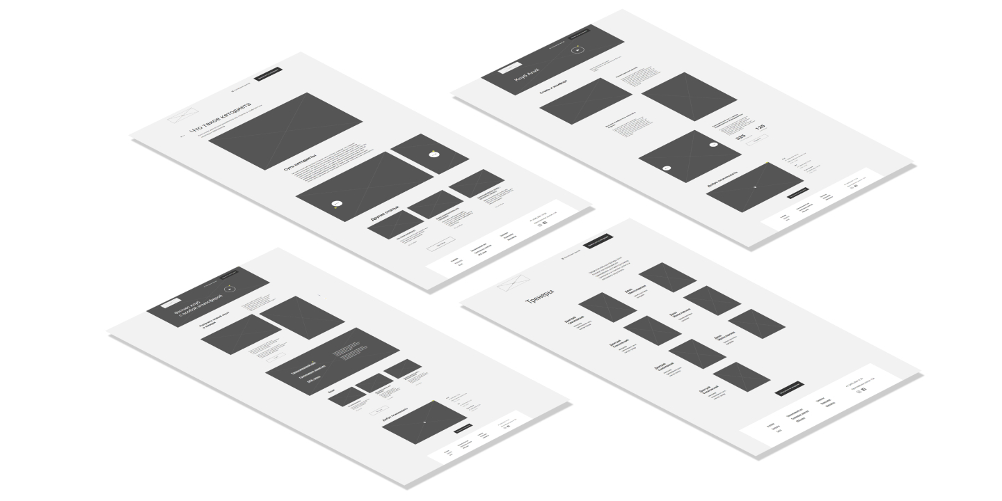
We studied the competitors, received the club owner’s ideas, analysed the target audience and came up with the perfect prototype.
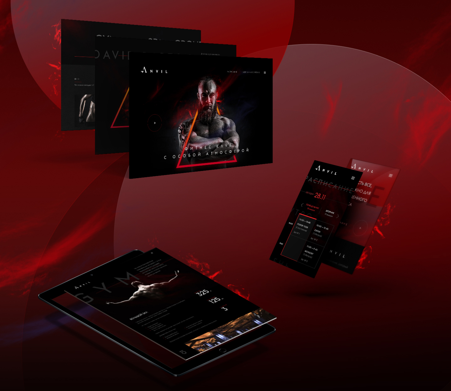
The design was based on the club’s brand identity:
- minimalism
- flames
- accent fonts
- contrasts
- airy, not cramped blocks.
The site is adapted perfectly for mobiles and desktops.
client Describe the task, we will contact you
and outline an action plan.


